Website redesign

Planned Redesign

Redesign (Tablet)

Before redesign
Planned Redesign

Brief
These are proposed changes for a Mercedes-Benz dealership's website. The changes were extensively researched to optimize functionality and modernize visuals.
Objectives
1. Improve the usability of the website. The old site made poor use of space.
3. Reduce the number of unnecessary items visible on the home screen. The user will have an easier time navigating the site to find what they're looking for.
2. Streamline the UX by prioritizing important elements. Manipulates users to view content that will maximize new car sales.
4. Capture the concept of luxury and technological innovation by utilizing modern design elements and showcasing the new Electric vehicles.

Homepage layout
Information that isn't related to purchasing a vehicle is located on the left 2/3 of the screen.
Included on this side of the page, are the Dealership locations, and a hamburger menu to view other options.
In contrast to the old design, the hours of operation are easily visible, and not intrusive.

All information regarding available services and vehicle listings are located on the right 1/3 of the screen.
The buttons were redesigned and modernized making browsing the different categories of vehicles easy.
The dealerships stressed the importance of advertising their social links, so I dedicated space in the bottom center.
Browsing inventory, made easier.


One of the main issues with the old design was the difficulty customers had browsing in-stock vehicles. This was addressed by making the vehicle inventory immediately visible on the home screen. Users scroll to find their desired vehicle, which were grouped & categorized by size, from largest to smallest.
To maximize incentive to purchase a vehicle, a banner displays current sales events happening in the dealership.
OLD MOBILE SITE
The old mobile website has many of the same issues that the PC site had:
1. An inefficient use of space. Elements are too close together.
2. Dated image and design. The car in the background is from 2016...
3. Redundant and intrusive buttons: "Chat with sales" is present in 3 locations, and covers other buttons
4. The dealership's social media growth is limited by problem 3.
5. Lacks character and fails to hold a users attention. This site is a reflection of Mercedes-Benz, and needs to match it's prestige.

NEW MOBILE SITE
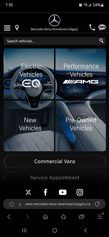
The new mobile addresses all the issues listed previously.
1. The buttons are given room to breathe rather than being crammed together.
2. Images are refreshing and modernized.
3. "Chat with sales" button is visible after scrolling down past "Service appointment", since the 'Call' and 'SMS' buttons are already present on the top right.
4. Location of the social links is persistent regardless of scrolling.
5. With the use of rounded edges, modernized images, bright colors and more, the site is given life and now perfectly resembles the technological innovation and prestige of Mercedes-Benz.

